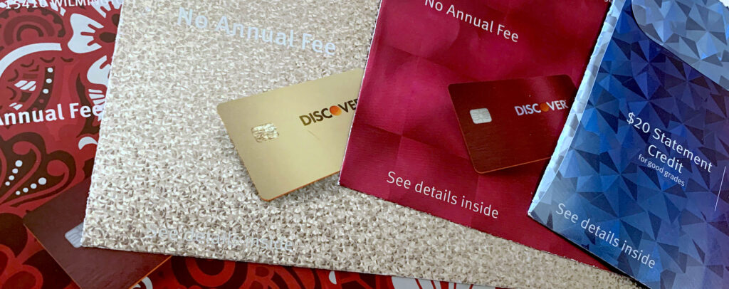
Over the past few years, Discover Card has sent their direct mail promotions in envelopes that are truly revolutionary: holographic, five-color printed, and often oversized. Since they’ve been utilizing direct mail to recruit new customers for years, why are they spending so much of their budget on expensive envelopes that just get opened and thrown away?
Simple. They found customers are more likely to open—and respond to—materials sent in an envelope that dazzles the eye. Such an envelope makes the recipient feel special, part of a select group, much like being a member of a club or team.
1. Stand Apart from the Crowd
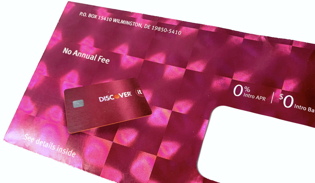
When utilizing an unusual substrate such as fresnel lens holographic paper, the best approach is often the easiest. Make the substrate the hero.
When utilizing an unusual substrate such as fresnel lens holographic paper, the best approach is often the easiest. Make the substrate the hero.
Discover Card printed a full bleed of red ink on top of the holography, but except for the actual card image, without any hits of opaque white underneath, so the full effect of the refracted light from the fresnel lens shines through. Its bright colors and unusual special effects make this piece stand miles apart from similar direct mail envelopes.
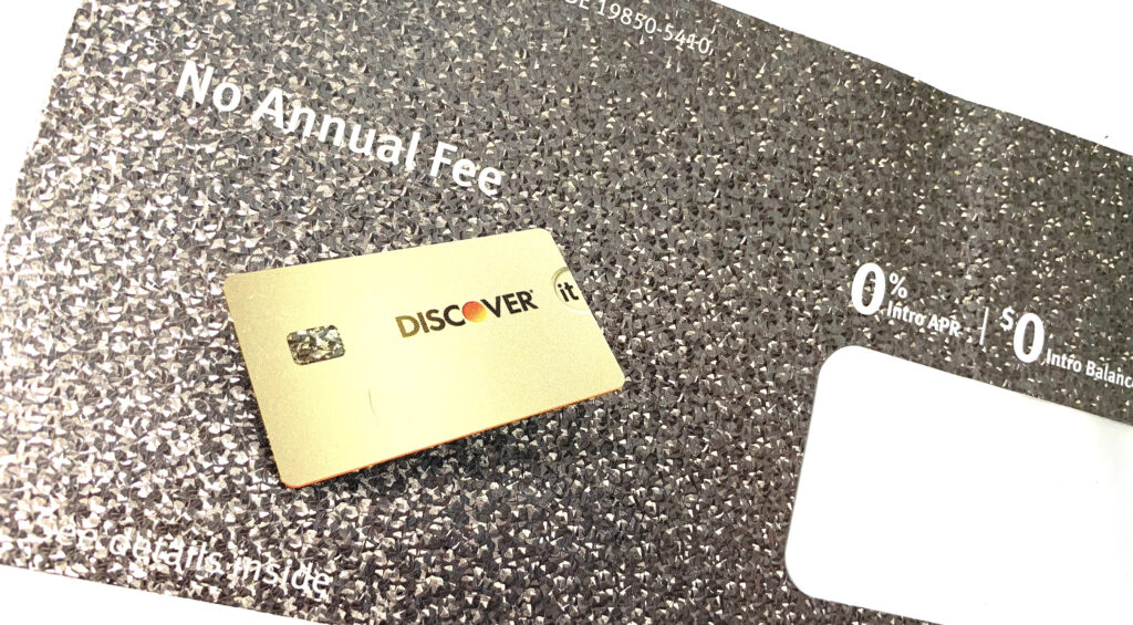
2. Make Customers Feel Like a Million Bucks
As symbols of prosperity, luxury, and success for centuries, metallics may be the most effective of all the colors. Metallic silver and gold embellishments on a direct mail envelope imply that the information contained within is prize-worthy, or may even make the recipient rich beyond their wildest imaginings.
3. Match the Design to your Audience
Geometric designs are trending with Zoomers (Generation Z). So it’s no surprise that college students, the demographic for this campaign, would find this cyan-to-magenta blend on geometric holographic paper intriguing.
No doubt this envelope got noticed—and opened—by a far greater percentage of college-age recipients than if it had been sent in a plain, white one.
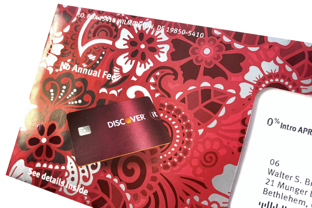
4. Impress Your Audience with Artistry
This crimson floral illustration is beautifully enhanced by hits of a high-gloss spot UV that contrast against unprinted areas. These unprinted areas reveal the silver metallic paper underneath. In this instance, the special effects complement the floral illustration, transforming this commercial design into a work of art.
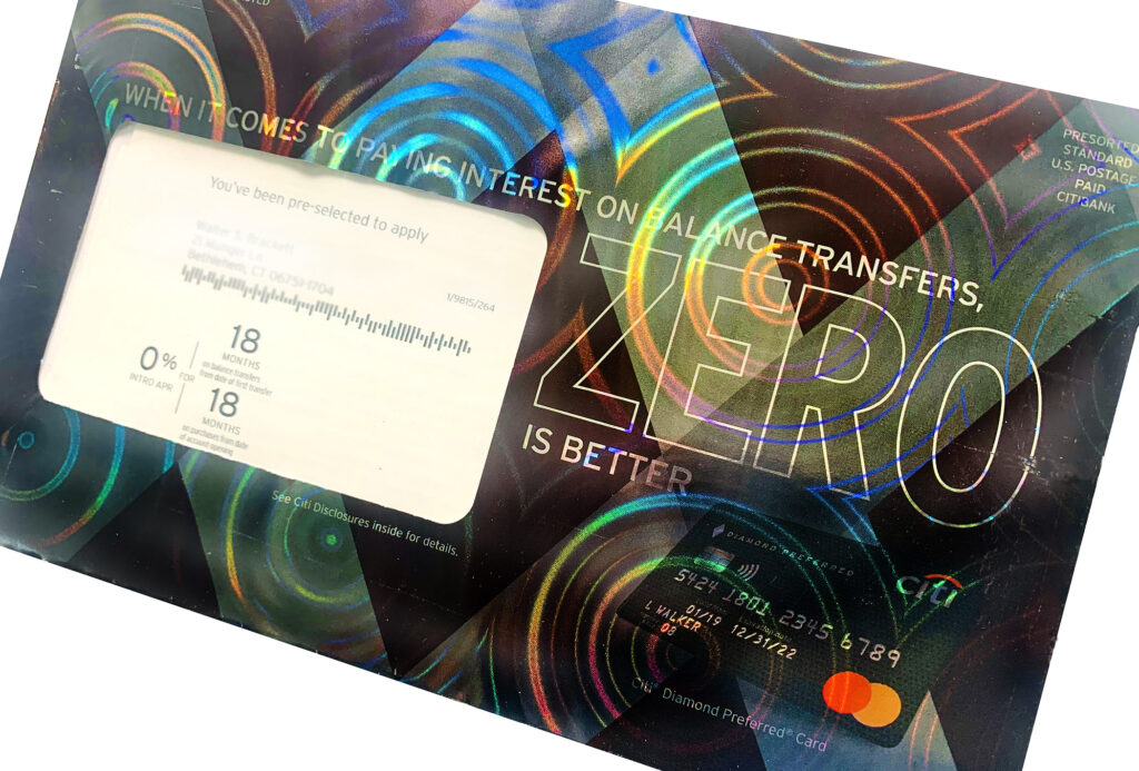
5. Mimic what Works
In the world of design, nothing is ever truly new. So when you stumble across a successful marketing technique, many companies will incorporate it into their own design strategies.
With a nod to Discover Card’s holographic direct mail campaigns, Citi Bank recently started printing their envelopes on holographic paper as well. This suggests that the designers at Discover hit upon such a goldmine of an idea when they started using holography on their envelopes that Citi Card decided to try it out on their customers as well.
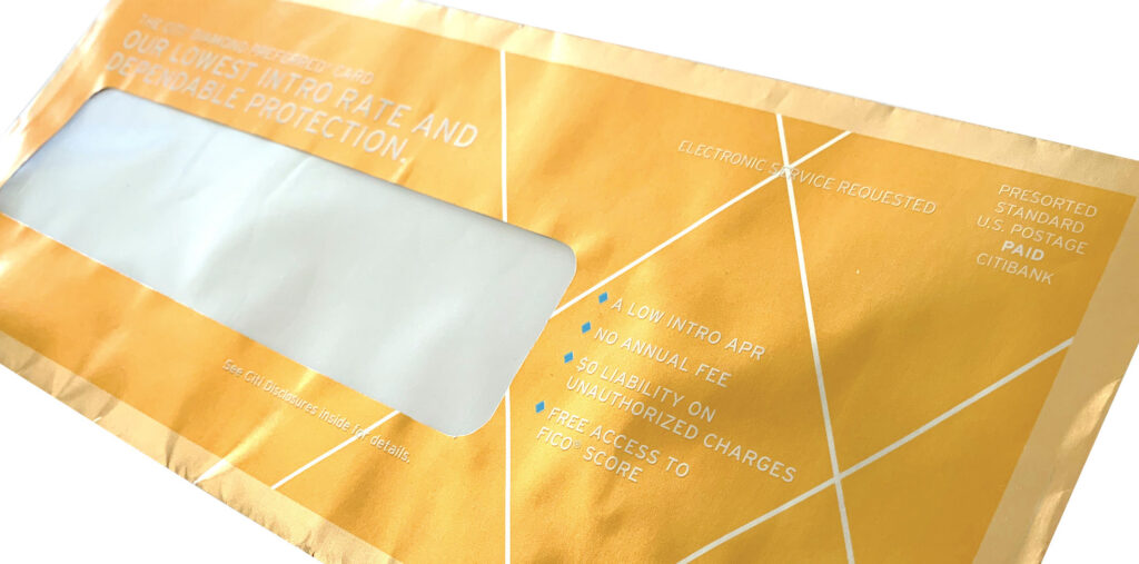
6. Embrace Design and Color Trends
According to Pantone and other color influencers, the signature color of 2021 is gold. Sometimes the best results will be achieved when you embrace the trends, as Citi Card did with their golden direct mail envelope.
Reminiscent of the golden ticket that Charlie found in a bar of Willy Wonka’s chocolate (and about the same size, too), this envelope design evokes feelings of winning, success, and celebration that will no doubt encourage recipients to take a peek inside.
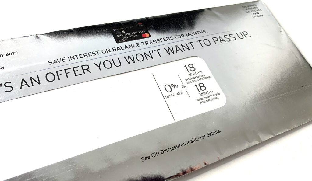
7. Go Big or Go Home
Sometimes bigger (or crazier) IS actually better. In this example, Citi Card pulled out all the stops when they utilized a bold, in-your-face holographic circular pattern in their latest direct mail envelope. Not only that, but the envelope is oversized, so it cannot help but scream “read me”!
Although the semi-opaque ink coverage “tames the beast”, so to speak, there’s no denying that in the right light, the bold holographic pattern will stop recipients in their tracks. The circular pattern also subtly supports the zero fee offer.
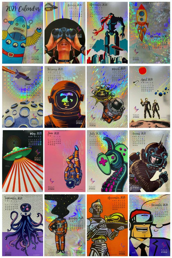
In March 2021, Mainline Holographics launched a new art competition to showcase the most creative and unique visions of the future.
Each winning entry will be printed on various patterns of holographic board and will be compiled into a calendar for 2022. Up to 14 winning entries will be selected, one for each month, as well as one for December of 2021 and a cover.
“It’s been a difficult past few years for businesses across the globe,” says Mainline Holographics’ Marketing Director Kim Guarnaccia. “So it’s the perfect time to look toward the future.”
The calendar competition will showcase the most creative perspectives of our future, whether it be retro Steampunk, UFOs, robots, or a Blade Runner-like dystopia. Holography is often seen as a cutting-edge technique, says Guarnaccia, which makes it ideal to combine with futuristic imagery.
Artists, designers, and illustrators can submit up to five designs at 11” x 17” size and each entry is FREE. Each winning artist will be publicized within the calendar, on the Mainline website, in trade magazines, and on social media. Winners will also receive free copies of the printed calendar and a frameable awards certificate.
“Few artists know how well holography augments a design or illustration, as they’ve had little or no chance to experiment with it,” explains John Tillinghast, National Sales Director at Mainline. “By printing their work on a colorful holographic background, competition winners will gain a wider audience for their work AND get the opportunity to play with this phenomenal medium.”
Golden hues speak to new opportunities, optimism, and success. Although brand-owners have embraced the use of gold in packaging for decades, startup companies are also using gold inks, foils, and boards to imbue their new products with an aura of permanence and dependability, so consumers can feel safe buying from them. This couldn’t be more perfect timing, as color influencers such as Pantone and Shutterstock have selected Champagne gold as the signature color of 2021.
Opulent Gold Packaging
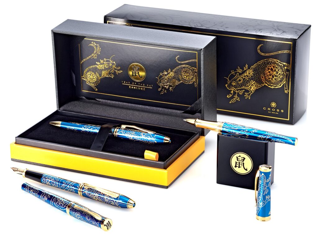
Luxury brands have often used gold accents to elevate a limited-edition product from special to extra-special. Such is the case with prestige pen producer A.T. Cross.
When designing their Chinese Zodiac limited-edition pen set packaging, Sal Juarez of Sketchworkx enclosed the pen container in a matte black folding carton imprinted with a gold foil design. He then blind varnished zodiac patterns on the sides of the carton before applying a protective scuff coat.
“The Chinese believe that gold is a harbinger of good fortune,” explains Juarez, “so it made sense to print the zodiac design in a color that the Chinese find beneficent.” The pen set sold so well that the company re-released several other limited-edition sets as well.
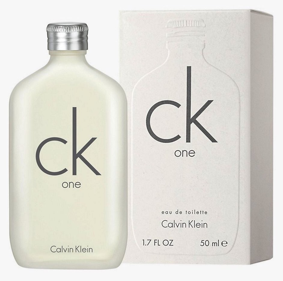
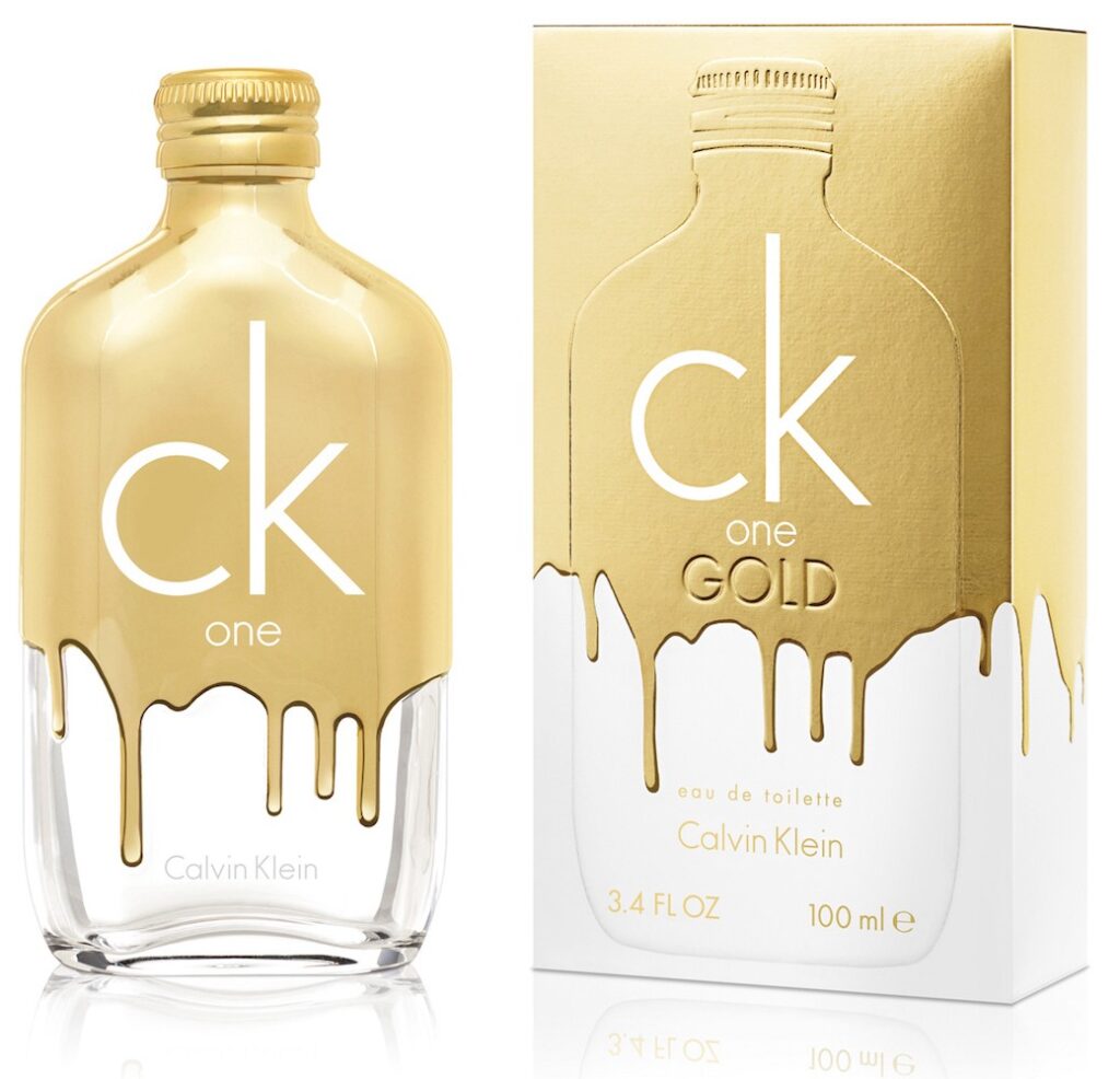
Metallic effects can also help distinguish between an original product and a new release targeted at a different group of consumers. Calvin Klein took this to the extreme when designing its new CK One Gold. Usually embracing a minimalist aesthetic, the design team broke all rules by making the new product release appear as if the CK One bottle and packaging had been dipped in liquid gold.
To achieve this hyper-realistic effect, designer Stephen Moss applied gold foil to the top half of the carton. He then embossed the gold drips. When the fragrance cartons now sit beside each other on the store shelf, the playful yet opulent carton makes it easy for consumers to distinguish between the original CK One and the premium version.
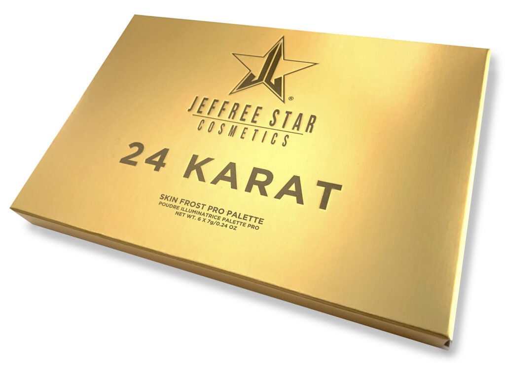
Cosmetics company Jeffree Star also achieved packaging “gold” with their not-so-subtle approach to metallics. With a name like 24 Karat, it’s no surprise that Don Romine of Impress Communications chose to embrace gold’s universal appeal when designing the packaging for this new product release.
Since foils don’t cover large regions well, Romine instead printed brown and orange inks on a silver met/pet board, and then debossed the text for added dimensionality. The result? A realistic-looking brushed-gold bar package that has sold so well that it quickly became a website top seller.
An Aura of Permanence
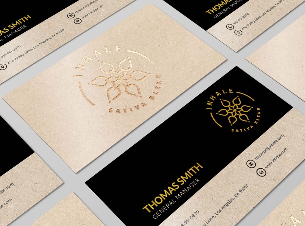
Startups that usually embrace a nature-based aesthetic are also realizing the benefits of metallic printing effects and substrates. Not only do gold embellishments help a brand stand apart from its competitors, but it also fosters a sense of longevity, characteristics that new companies with little to no track record must cultivate in order to develop long-term, loyal customers.
Inhale is one such startup. Although they wanted to emphasize the organic basis of cannabis, they also wanted to support their clinical side as well. So Wendy Barr of Barr Code Branding suggested a brand design that included both kraft board and gold foil.
“The upscale gold foil against the natural-looking kraft created a design tension the company loved,” Barr explains. “The gold reflected their science-based approach to mixing extracts while the kraft embodied the natural aspect of the plant.”
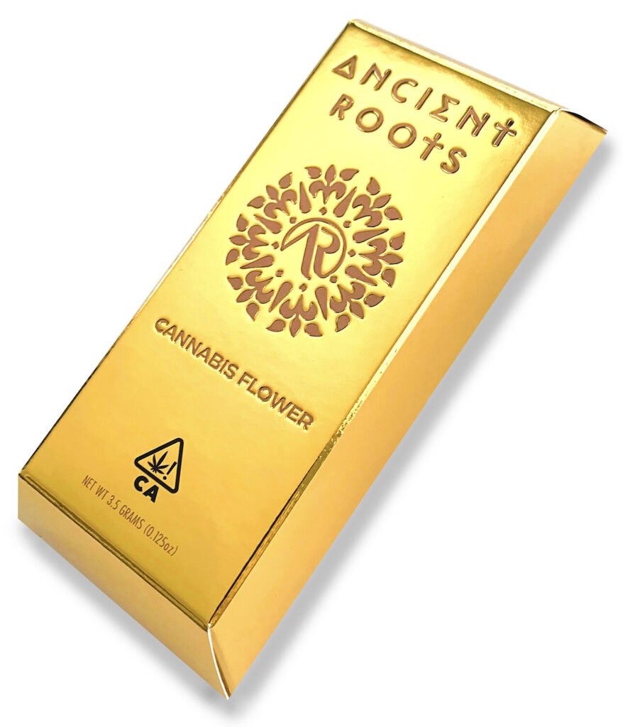
Startup Ancient Roots also took a leap of faith when they decided to play with gold packaging. Instead of taking baby steps by using just a few golden accents, however, they went all-in by creating a carton that looked and felt like a heavy gold ingot.
Utilizing a met/pet silver board, Impress Communications first experimented with transmuting the metallic silver into gold by overprinting a series of transparent yellow inks. Their ink lab then converted the recipe into a custom PMS to apply to the silver board. They then printed the text in a brown PMS and debossed the logo and text. To make sure the inks would dry quickly and trap properly, they printed the packaging with UV inks on a UV press. The end result? A carton that appears to have been smelted by Viking craftsmen in a centuries-old forge.
Let Design Dictate the Process
Since ech process for creating a gold effect has its benefits and downsides, it’s important to understand what techniques work best with any given design before finalizing the project or setting a print budget.
Applied like any other spot color, metallic inks retain a greater level of detail than other printing methods. So for projects with intricate designs or small font sizes, metallic ink is the way to go. Just be mindful that since metallic inks are not fully opaque, the color may shift, depending on the shade of the board.
Moreover, to achieve a shiny effect, print on white glossy board, as the fibers in textured or matte board tend to soak up ink. Foil experts also recommend applying a protective coating to the finished package. Also, avoid embossing/debossing areas that have been printed with metallic inks, as the metal flecks in the ink make the ink prone to cracking, especially over time.
If your packaging design does not have areas that require wide coverage, has fine details, or features small font sizes, then printing with metallicfoil is an ideal solution. Foil stamping requires that the printer create a custom die, so depending on the number of metallic colors or textures desired, it can be costly to print. However, unlike metallic inks, metallic foil is 100% opaque so the color will remain consistent, regardless of the substrate used. Foils also retain clarity when embossed/debossed.
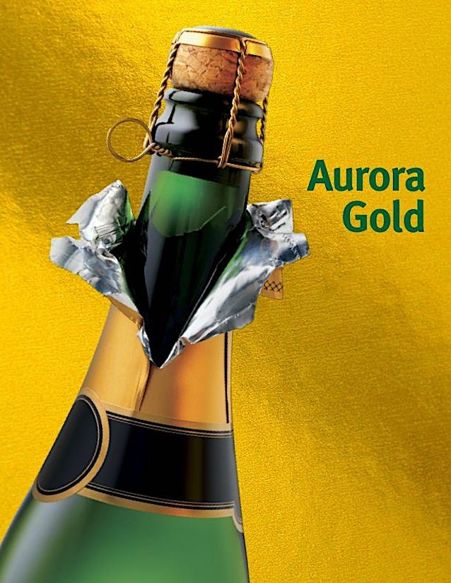
Mainline Holographics’ Aurora Gold provides an exceptional gold backdrop to any packaging project.
If large areas of the package need to be printed in a metallic, then metalized board is the way to go. Pre-made metallic board can be easily overprinted; just make sure to apply a hit or two of opaque white to key areas to prevent bleed-through.
Whichever process is used to support your package design, adding a gold metallic background or embellishment will help secure a positive relationship with one’s customer and elevate the brand. Champagne, anyone?
Every year, educational institutions such as universities and prep schools mail out thousands of pamphlets to prospective students. The brochures tout their educational programs and extracurricular offerings, in hopes of leading students to apply to their campus… or for their alumni to donate funds. But do they work? Do they make students feel so excited about enrolling that they make your school their #1 pick? The answer is yes, promotional materials do work. And personalizing message and imagery with variable data printing, say some studies, can increase response rates by as much as 35%.
Personalization = Response
Marketing experts have known for decades that the more often a message is personalized, the better the response. But marketers could not personalize a student’s entire registration experience until certain advances had been made in digital printing.
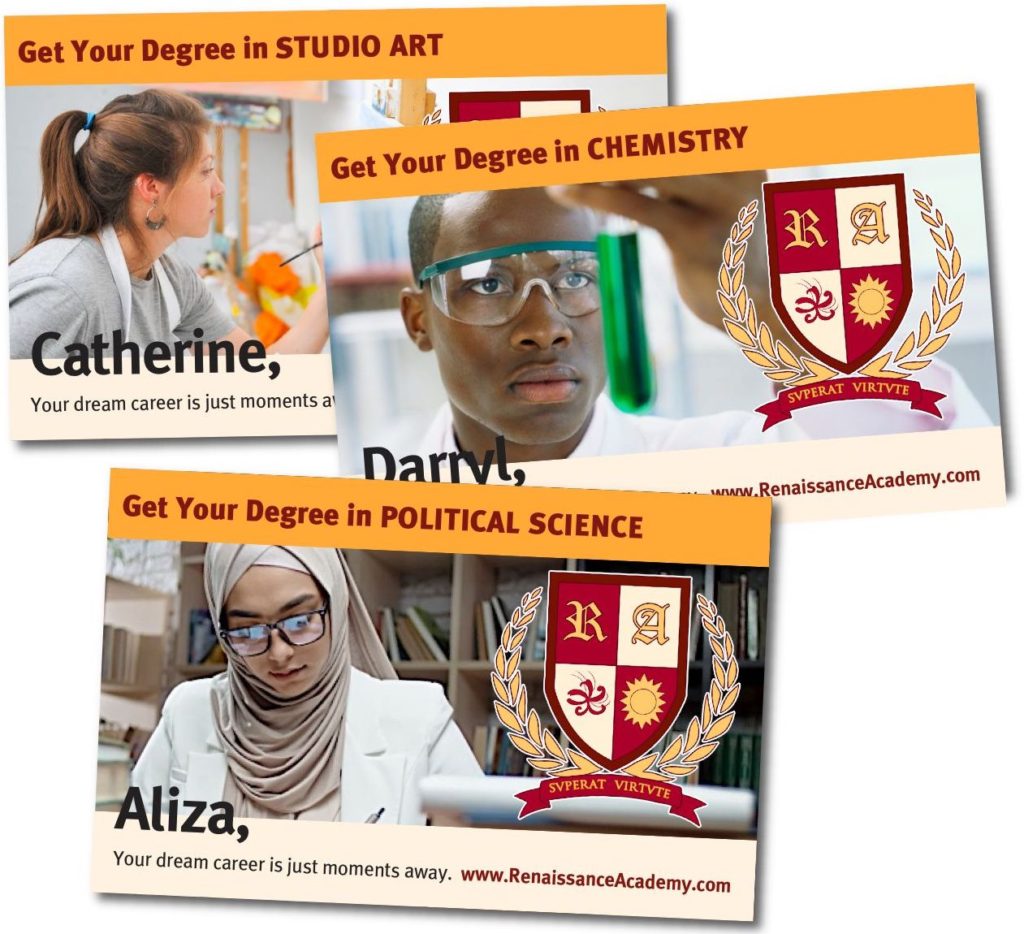
In this example of VDP, the image, student’s name, and degree are all variable.
For instance, the pamphlet sent to prospective students can feature the same design, but each may also have content relevant to their major (English, Physics, etc). Likewise, an athlete might receive a brochure that showcases college sports photos while an artist might receive a brochure that features imagery from the campus museum.
To make students feel more included, marketers can align imagery or content with an individual’s culture or background.
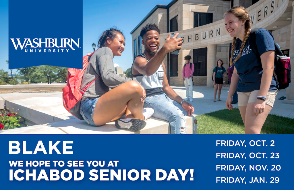
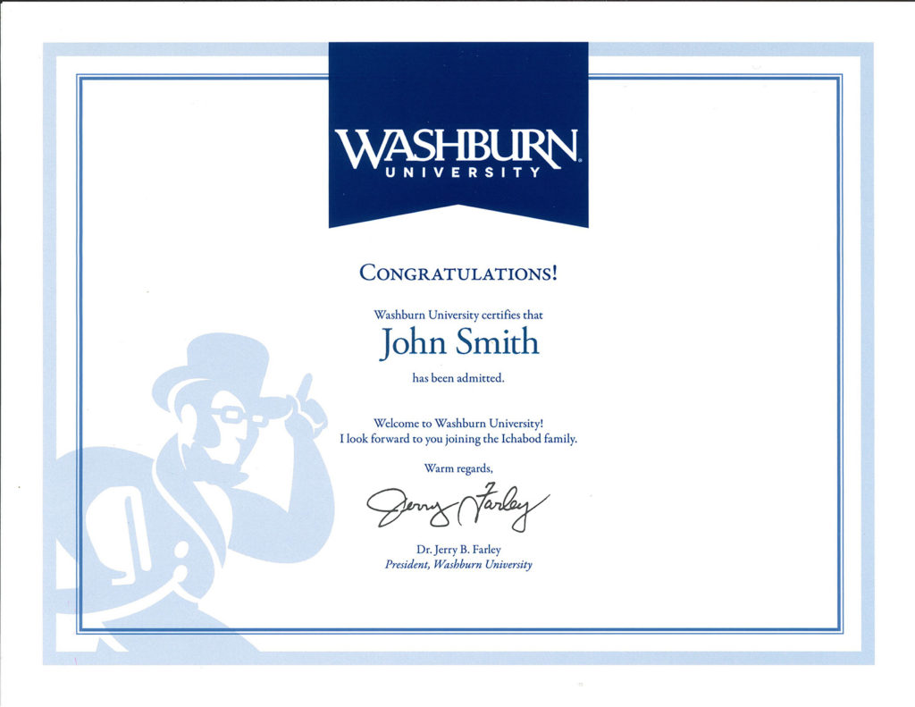
Washburn University’s Admissions Office utilizes variable data to connect with incoming students during the recruitment phase and in its acceptance packets.
Personalized fundraising communications can even improve an alumni’s connection to their alma mater, generating more donations over the years.
Challenges with Variable Data
According to Washburn University’s Assistant Director of Marketing Travis Perry, designing data-compliant materials or printing the pieces is not their greatest challenge. Their largest stumbling block lies in maintaining an accurate database.
“It takes coordination, but variable data printing keeps us from sending the same materials to the same students at the same time,” explains Perry. “Yet it’s also imperative to have a printing partner that’s adept at VDP, as we have with Mainline Printing.”
Perry also reiterates the importance of having clean data on the back end. “It doesn’t matter how good your template is,” he explains, “poorly formatted variable data can ruin even the best design.”
Amy Bladow, Sr. Project Specialist at the University of Notre Dame, concurs with Perry. “Without an accurate database, your best efforts can backfire,” she explains. “There is nothing worse than accidentally personalizing a direct mail piece with someone else’s name or info. In fact, it’s worse than sending a generic piece.”
Provided that the database is accurate, variable data can be a boon for marketers. Digital presses don’t have a minimum run. So prior to sending out a bulk mailing, marketers can mail out a short-run test to gauge which colors, messaging, or graphics generate the best response. Based on the results, marketers can then update the bulk mail design accordingly.
The result? If properly utilized by educational marketers, variable data printing can foster in students a greater sense of belonging and a lifetime of school spirit.
In 1984, National Geographic made news when it became the first national magazine to feature holography on its cover (a label of an eagle). The following year, they applied a holographic label of a skull to a printed cover. Then in 1988, they published the first-ever ink-free, entirely holographic cover.
The 1988 National Geographic cover was the first entirely ink-free magazine cover design.
Each of these issues have since gone on to become collector’s items. But holography, which was once desirable for its cutting-edge appeal has, in the following decades, lost its glamour. Consumers have become used to seeing the tiny holographic stickers on their credit cards and checks. And the public’s fondness for innovative technology has shifted to QR codes and augmented reality (AR).
Even so, holography remains a useful tool for package designers, helping to solve tricky design challenges as they arise.
Keep it Fresh
Growing up on TikTok, YouTube, and other bits of digital wizardry, Millennials and Gen Z’ers have a shorter attention span than their less tech-savvy forebearers. In fact, according to one report, Millennials have a 12-second attention span but Zoomers just 8. As such, marketers must now identify new ways to attract their attention while being innovative, relevant, and fun.
When Lit Co. challenged Jamison Perkins of Jamison’s Design to design the packaging for ceramic shot glasses for 20-somethings, he was up for the task.
To complement the glass’ pastel colors, he chose to laminate rainbow holographic paper to corrugate. The corrugate protected the breakable glass from damage during transit while the eye-catching holographic litho-lam appealed to younger buyers.
Designs for Upscale Elegance
Although younger audiences respond well to bright colors and bold patterns, holography can also be the ideal surface for luxury brand packaging.
In 2016-18, social norms and fashions shifted to a more casual, athletic vibe. As such, Victoria’s Secret, which had remained steadfast in its branding since the 1990s, began losing market share. In an effort to stay relevant, VS shifted their strategy from the glitz, glitter, and glamour they had previously embraced to a more elevated, upscale aesthetic.
Although holography is often considered to be most relevant to a younger demographic, when given the right design treatment, it can also be the ideal surface for luxury branding.
In the case of Dream Angel’s perfume packaging, the original carton design featured pastel clouds on holographic foil. Unfortunately, this no longer fit VS’ rebranding initiative. Moreover, the team needed to reflect the refractive fragrance bottle and the “rainbow glow” scent in the packaging.
The solution? Packaging team Design Director Stephen Moss made the actual rainbow holographic board the hero of the redesigned fragrance box.
This was a wise choice. The pop of color appealed to younger generations while mature consumers appreciated its more formal composition and understated elegance.
Reflect the Product Within
Sometimes the best designs are developed when designers seek to mirror the actual product. In such cases, holography may be the perfect solution.
Don Romine of Impress Communications found this to be the case when Jeffree Star Cosmetics asked him to collaborate on a design for their Liquid Frost Highlighter.
Romine wanted to represent the highlighters’ oil-on-water appearance on the actual packaging. After much experimentation, he achieved the effect by printing the carton onto holographic board that featured aswirl pattern. Since the pattern is random, each carton became a unique, one-of-a-kind statement piece, the perfect reflection of the product within.
Revitalize Tired Packaging
Since holographic effects are unlimited, the technique can also revitalize a tired packaging design. Holography also adds dimensionality to cartons that are restricted to a certain size, such as with DVD case jackets or game boxes.
Tasked by a film studio to design a DVD case that stood out from the hundreds of others with the same dimensions, Debbie Bishop of DB Design went out on a limb. She decided to overprint holographic board with designs that allowed the holographic pattern to show through. The holography enhanced the DVD’s shelf presence AND ultimately transformed the DVD into a collector’s item!
Today, holography is no longer just used to make a statement about cutting-edge technology; rather, it can solve tricky design challenges, elevate a brand, reach younger audiences, and even to gain an advantage over their competitors.
With Mainline Holographics‘ new white holographic technique—and recyclable holographic board on the horizon—the art of holography has become an indispensable tool for designers the world over.