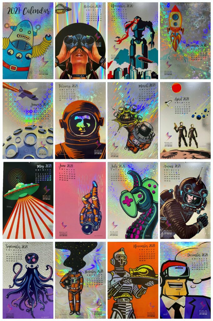
In March 2021, Mainline Holographics launched a new art competition to showcase the most creative and unique visions of the future.
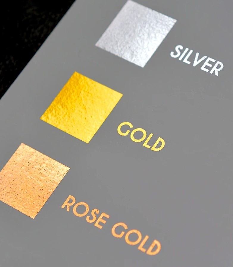
Each winning entry will be printed on various patterns of holographic board and will be compiled into a calendar for 2022. Up to 14 winning entries will be selected, one for each month, as well as one for December of 2021 and a cover.
“It’s been a difficult past few years for businesses across the globe,” says Mainline Holographics’ Marketing Director Kim Guarnaccia. “So it’s the perfect time to look toward the future.”
The calendar competition will showcase the most creative perspectives of our future, whether it be retro Steampunk, UFOs, robots, or a Blade Runner-like dystopia. Holography is often seen as a cutting-edge technique, says Guarnaccia, which makes it ideal to combine with futuristic imagery.
Artists, designers, and illustrators can submit up to five designs at 11” x 17” size and each entry is FREE. Each winning artist will be publicized within the calendar, on the Mainline website, in trade magazines, and on social media. Winners will also receive free copies of the printed calendar and a frameable awards certificate.
“Few artists know how well holography augments a design or illustration, as they’ve had little or no chance to experiment with it,” explains John Tillinghast, National Sales Director at Mainline. “By printing their work on a colorful holographic background, competition winners will gain a wider audience for their work AND get the opportunity to play with this phenomenal medium.”
Golden hues speak to new opportunities, optimism, and success. Although brand-owners have embraced the use of gold in packaging for decades, startup companies are also using gold inks, foils, and boards to imbue their new products with an aura of permanence and dependability, so consumers can feel safe buying from them. This couldn’t be more perfect timing, as color influencers such as Pantone and Shutterstock have selected Champagne gold as the signature color of 2021.
Opulent Gold Packaging
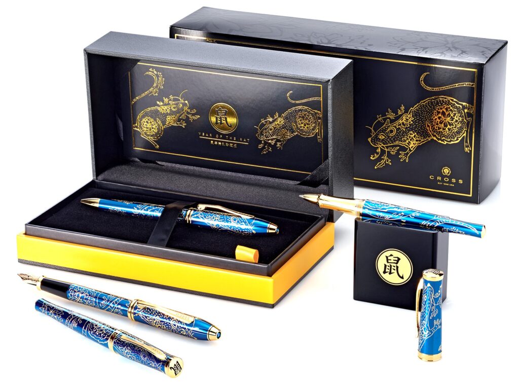
Luxury brands have often used gold accents to elevate a limited-edition product from special to extra-special. Such is the case with prestige pen producer A.T. Cross.
When designing their Chinese Zodiac limited-edition pen set packaging, Sal Juarez of Sketchworkx enclosed the pen container in a matte black folding carton imprinted with a gold foil design. He then blind varnished zodiac patterns on the sides of the carton before applying a protective scuff coat.
“The Chinese believe that gold is a harbinger of good fortune,” explains Juarez, “so it made sense to print the zodiac design in a color that the Chinese find beneficent.” The pen set sold so well that the company re-released several other limited-edition sets as well.
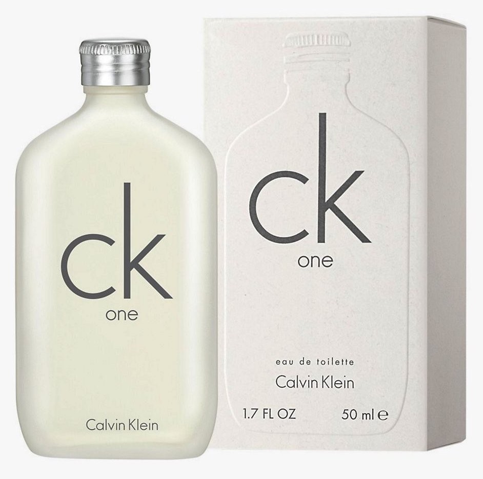
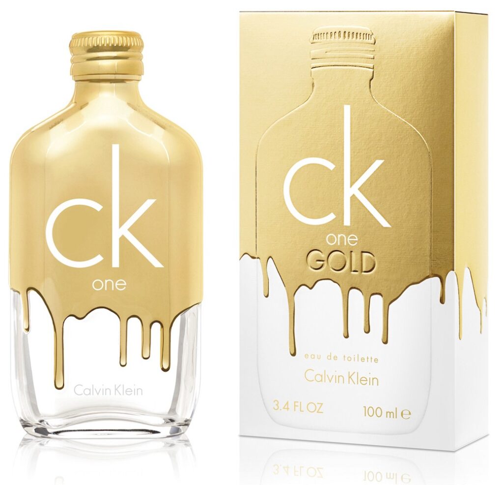
Metallic effects can also help distinguish between an original product and a new release targeted at a different group of consumers. Calvin Klein took this to the extreme when designing its new CK One Gold. Usually embracing a minimalist aesthetic, the design team broke all rules by making the new product release appear as if the CK One bottle and packaging had been dipped in liquid gold.
To achieve this hyper-realistic effect, designer Stephen Moss applied gold foil to the top half of the carton. He then embossed the gold drips. When the fragrance cartons now sit beside each other on the store shelf, the playful yet opulent carton makes it easy for consumers to distinguish between the original CK One and the premium version.
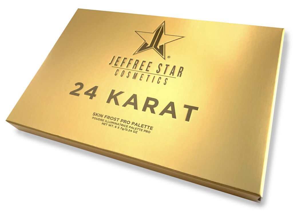
Cosmetics company Jeffree Star also achieved packaging “gold” with their not-so-subtle approach to metallics. With a name like 24 Karat, it’s no surprise that Don Romine of Impress Communications chose to embrace gold’s universal appeal when designing the packaging for this new product release.
Since foils don’t cover large regions well, Romine instead printed brown and orange inks on a silver met/pet board, and then debossed the text for added dimensionality. The result? A realistic-looking brushed-gold bar package that has sold so well that it quickly became a website top seller.
An Aura of Permanence
Startups that usually embrace a nature-based aesthetic are also realizing the benefits of metallic printing effects and substrates. Not only do gold embellishments help a brand stand apart from its competitors, but it also fosters a sense of longevity, characteristics that new companies with little to no track record must cultivate in order to develop long-term, loyal customers.
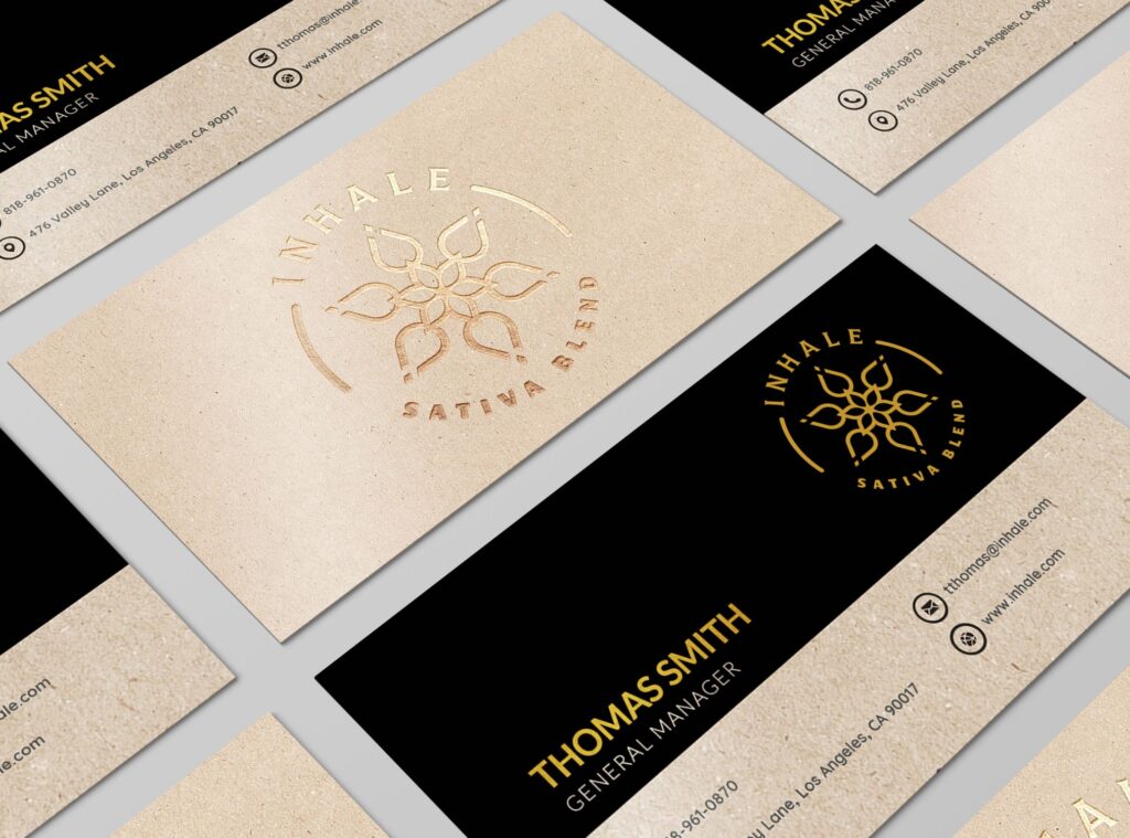
Inhale is one such startup. Although they wanted to emphasize the organic basis of cannabis, they also wanted to support their clinical side as well. So Wendy Barr of Barr Code Branding suggested a brand design that included both kraft board and gold foil.
“The upscale gold foil against the natural-looking kraft created a design tension the company loved,” Barr explains. “The gold reflected their science-based approach to mixing extracts while the kraft embodied the natural aspect of the plant.”
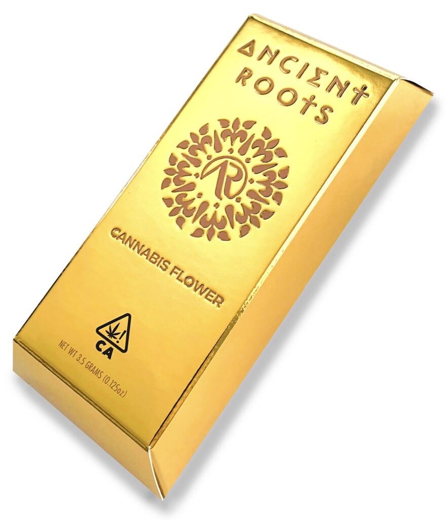
Startup Ancient Roots also took a leap of faith when they decided to play with gold packaging. Instead of taking baby steps by using just a few golden accents, however, they went all-in by creating a carton that looked and felt like a heavy gold ingot.
Utilizing a met/pet silver board, Impress Communications first experimented with transmuting the metallic silver into gold by overprinting a series of transparent yellow inks. Their ink lab then converted the recipe into a custom PMS to apply to the silver board. They then printed the text in a brown PMS and debossed the logo and text. To make sure the inks would dry quickly and trap properly, they printed the packaging with UV inks on a UV press. The end result? A carton that appears to have been smelted by Viking craftsmen in a centuries-old forge.
Let Design Dictate the Process
Since ech process for creating a gold effect has its benefits and downsides, it’s important to understand what techniques work best with any given design before finalizing the project or setting a print budget.
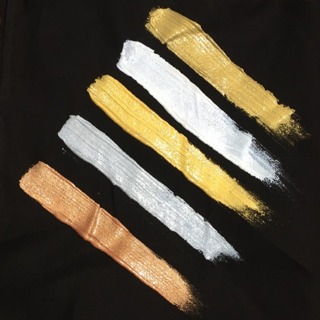
Applied like any other spot color, metallic inks retain a greater level of detail than other printing methods. So for projects with intricate designs or small font sizes, metallic ink is the way to go. Just be mindful that since metallic inks are not fully opaque, the color may shift, depending on the shade of the board.
Moreover, to achieve a shiny effect, print on white glossy board, as the fibers in textured or matte board tend to soak up ink. Foil experts also recommend applying a protective coating to the finished package. Also, avoid embossing/debossing areas that have been printed with metallic inks, as the metal flecks in the ink make the ink prone to cracking, especially over time.
If your packaging design does not have areas that require wide coverage, has fine details, or features small font sizes, then printing with metallicfoil is an ideal solution. Foil stamping requires that the printer create a custom die, so depending on the number of metallic colors or textures desired, it can be costly to print. However, unlike metallic inks, metallic foil is 100% opaque so the color will remain consistent, regardless of the substrate used. Foils also retain clarity when embossed/debossed.
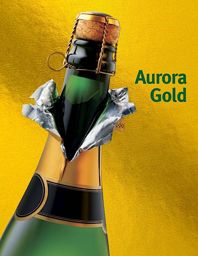
Mainline Holographics’ Aurora Gold provides an exceptional gold backdrop to any packaging project.
If large areas of the package need to be printed in a metallic, then metalized board is the way to go. Pre-made metallic board can be easily overprinted; just make sure to apply a hit or two of opaque white to key areas to prevent bleed-through.
Whichever process is used to support your package design, adding a gold metallic background or embellishment will help secure a positive relationship with one’s customer and elevate the brand. Champagne, anyone?