7 Kick-Ass Envelope Designs by the Credit Card Experts
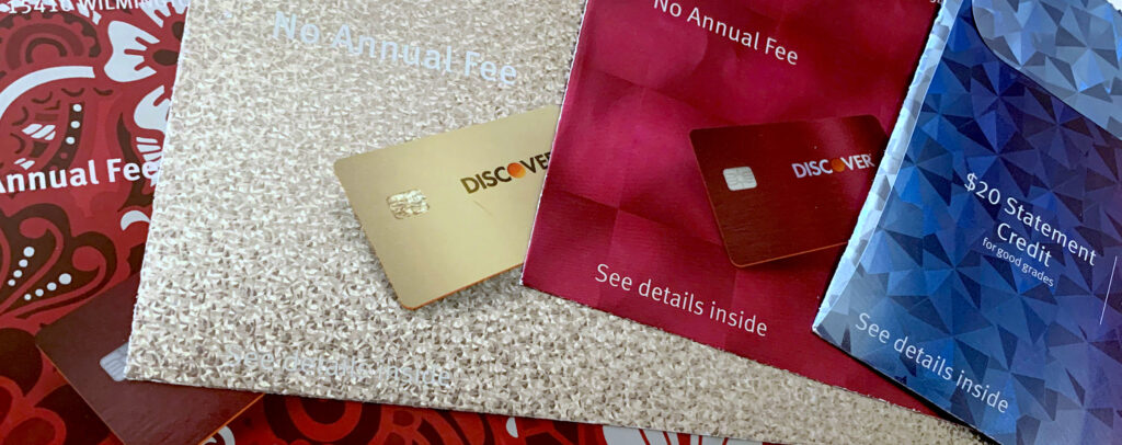
Over the past few years, Discover Card has sent their direct mail promotions in envelopes that are truly revolutionary: holographic, five-color printed, and often oversized. Since they’ve been utilizing direct mail to recruit new customers for years, why are they spending so much of their budget on expensive envelopes that just get opened and thrown away?
Simple. They found customers are more likely to open—and respond to—materials sent in an envelope that dazzles the eye. Such an envelope makes the recipient feel special, part of a select group, much like being a member of a club or team.
1. Stand Apart from the Crowd
When utilizing an unusual substrate such as fresnel lens holographic paper, the best approach is often the easiest. Make the substrate the hero.
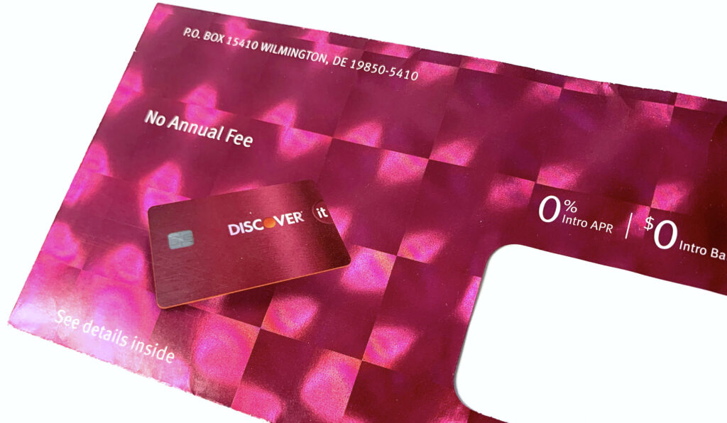
When utilizing an unusual substrate such as fresnel lens holographic paper, the best approach is often the easiest. Make the substrate the hero.
Discover Card printed a full bleed of red ink on top of the holography, but except for the actual card image, without any hits of opaque white underneath, so the full effect of the refracted light from the fresnel lens shines through. Its bright colors and unusual special effects make this piece stand miles apart from similar direct mail envelopes.
2. Make Customers Feel Like a Million Bucks
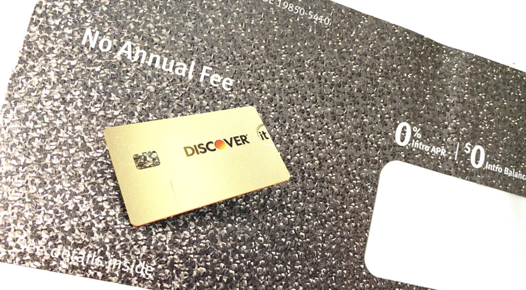
As symbols of prosperity, luxury, and success for centuries, metallics may be the most effective of all the colors. Metallic silver and gold embellishments on a direct mail envelope imply that the information contained within is prize-worthy, or may even make the recipient rich beyond their wildest imaginings.
3. Match the Design to your Audience
Geometric designs are trending with Zoomers (Generation Z). So it’s no surprise that college students, the demographic for this campaign, would find this cyan-to-magenta blend on geometric holographic paper intriguing.

No doubt this envelope got noticed—and opened—by a far greater percentage of college-age recipients than if it had been sent in a plain, white one.
4. Impress Your Audience with Artistry
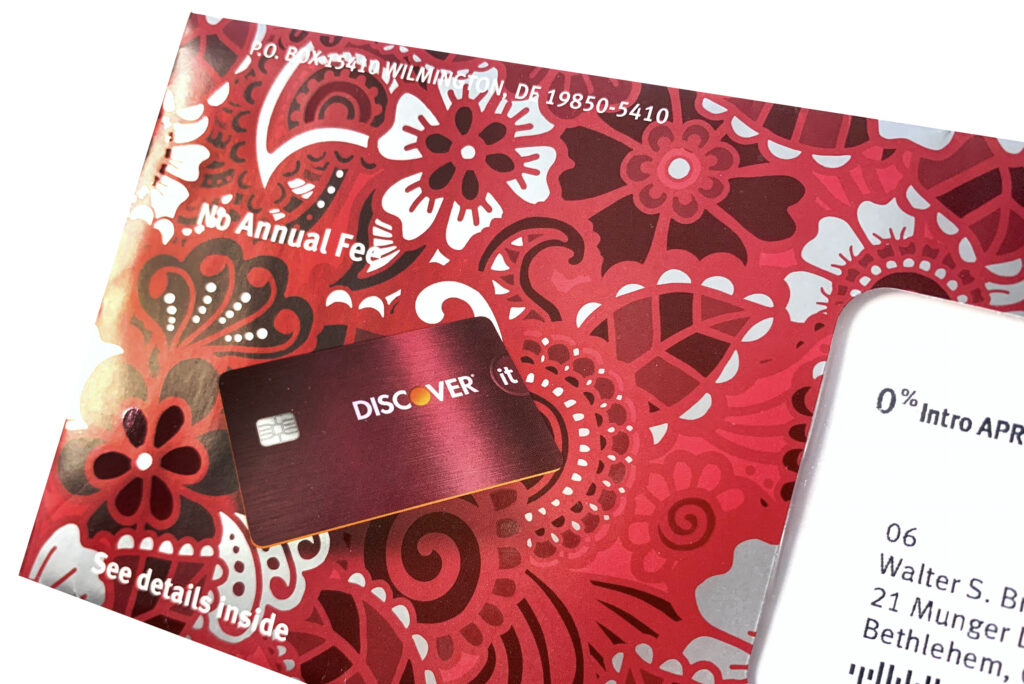
This crimson floral illustration is beautifully enhanced by hits of a high-gloss spot UV that contrast against unprinted areas. These unprinted areas reveal the silver metallic paper underneath. In this instance, the special effects complement the floral illustration, transforming this commercial design into a work of art.
5. Mimic what Works
In the world of design, nothing is ever truly new. So when you stumble across a successful marketing technique, many companies will incorporate it into their own design strategies.
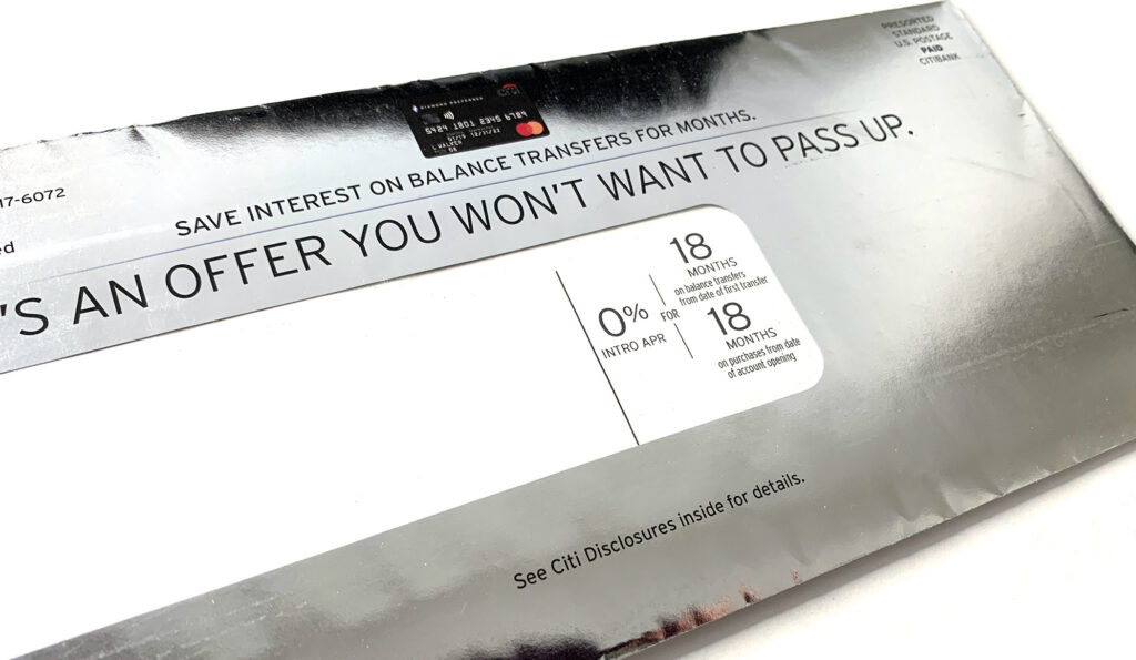
With a nod to Discover Card’s holographic direct mail campaigns, Citi Bank recently started printing their envelopes on holographic paper as well. This suggests that the designers at Discover hit upon such a goldmine of an idea when they started using holography on their envelopes that Citi Card decided to try it out on their customers as well.
6. Embrace Design and Color Trends
According to Pantone and other color influencers, the signature color of 2021 is gold. Sometimes the best results will be achieved when you embrace the trends, as Citi Card did with their golden direct mail envelope.
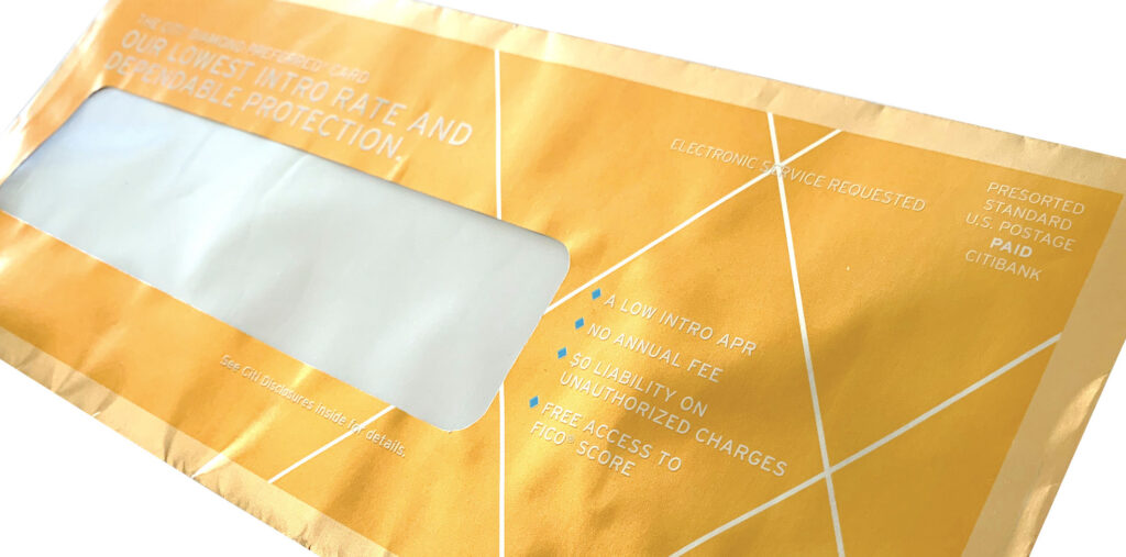
Reminiscent of the golden ticket that Charlie found in a bar of Willy Wonka’s chocolate (and about the same size, too), this envelope design evokes feelings of winning, success, and celebration that will no doubt encourage recipients to take a peek inside.
7. Go Big or Go Home
Sometimes bigger (or crazier) IS actually better. In this example, Citi Card pulled out all the stops when they utilized a bold, in-your-face holographic circular pattern in their latest direct mail envelope. Not only that, but the envelope is oversized, so it cannot help but scream “read me”!
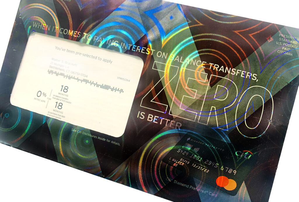
Although the semi-opaque ink coverage “tames the beast”, so to speak, there’s no denying that in the right light, the bold holographic pattern will stop recipients in their tracks. The circular pattern also subtly supports the zero fee offer.


