According to color influencers in ink, fashion, and photography, the color of 2022 is periwinkle and pink! If you want packaging that is on-trend yet stands apart, print on holographic board or label stock. A pink or purple ink or image printed over iridescent holography will make any image glow.
Start-ups are, by necessity, budget conscious. As such, cannabis packaging designers are embracing the use of holographic board as a way to inexpensively achieve dramatic effects.
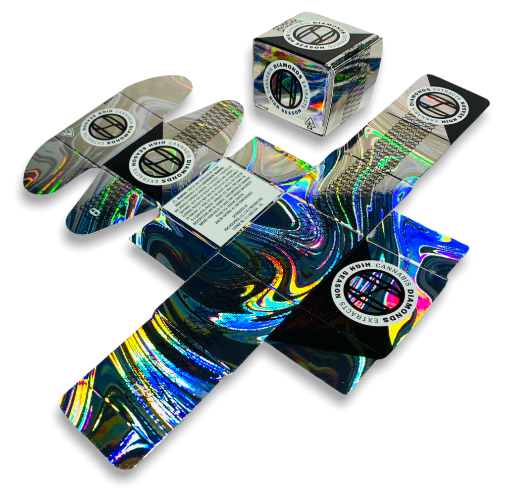
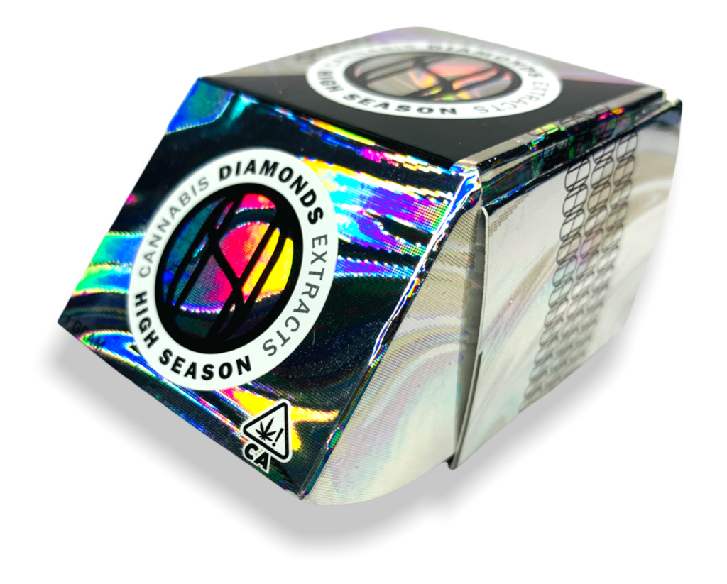
For instance, when the cannabis company High Season added a signature extract to their product line, they asked the the designers at DiDio and Associates for a carton design that would stand apart from their competitor’s packaging. They also wanted a package that would appear to be more high-end than their other, less expensive extracts.
With limited funds available, the designers kept the design simple, using just two spot colors and no special coatings. They also developed an adhesive-free folding carton design to minimize fulfillment costs.
The printer also identified a cost-savings opportunity by utilizing the same die for both the new signature extract carton and the cartons for their other extracts. To achieve the colorful playfulness that the client desired, the designers printed the carton on Mainline Holographics’ Swirl3 holographic stock pattern.
The arresting pattern matched High Season’s brand identity so well—and sales exceeded their expectations to such a degree—that the company now plans to print their other signature product packaging on holographic board as well.
To make your packaging memorable AND save on the cost of creating a custom design, utilize Mainline’s brilliant cannabis stock pattern!No minimum order requirements. For a quote, email kguarnaccia@mainlineprinting.com
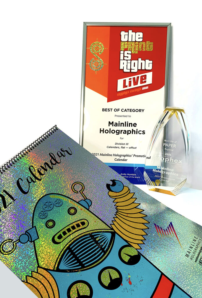
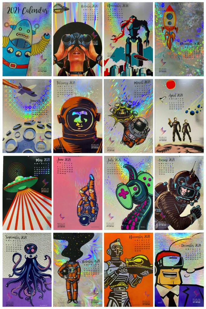
In June, Mainline’s 2021 promotional calendar won two key awards at the Printing and Imaging Association of MidAmerica’s Graphex annual competition: Best in Category (Calendars) and Best Use of Paper.
The Graphic Excellence (Graphex) competition honors outstanding technical achievements in innovation and print production by companies throughout Kansas, Missouri, Oklahoma, and Texas.
“Of all the entries, Graphex’s panel of judges felt Mainline’s calendar best transformed a piece of paper (in this case, holographic board) into a unique tool of communication, thereby earning the competition’s Best Use of Paper award,” says Jana Shanks, Regional Director of PIA MidAmerica. “It was also executed flawlessly, a testament to Mainline’s printing and converting services.”
Mainline’s promotional calendar also beat out over a dozen other calendar entries to win the Best in Category award.
“Hundreds of entries are submitted into the competition every year. So to be presented with not one award but two is quite an honor,” says John Tillinghast, Sales Director.
“We are super proud of our Marketing Director Kim Guarnaccia, as well as of our production team,” Tillinghast continues, “for doing such a stellar job producing the calendar.”
Designed by Guarnaccia, Mainline’s winning calendar features a separate page for each month of the year. Each page is also printed on a different holographic pattern. Each page also showcases a retro, space-age illustration that complements the eye-catching metallic holography.
The calendar, which is still usable through the end of the year, also features a hidden narrative.
“The first few months show images of people seeing UFOs in the sky, aliens landing on the planet, and rocket ships blasting into space,” Guarnaccia explains. “This suggests that the earth had been invaded by an alien race so to survive, humanity must flee to neighboring planets.”
“The narrative then moves onto space exploration, where space monsters attack the astronauts, leading to humanity’s takeover by robots,” Guarnaccia continues. “Finally, the last image shows a man wearing VR goggles, suggesting that the storyline all along may have been just a computer simulation.”
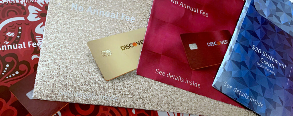
Over the past few years, Discover Card has sent their direct mail promotions in envelopes that are truly revolutionary: holographic, five-color printed, and often oversized. Since they’ve been utilizing direct mail to recruit new customers for years, why are they spending so much of their budget on expensive envelopes that just get opened and thrown away?
Simple. They found customers are more likely to open—and respond to—materials sent in an envelope that dazzles the eye. Such an envelope makes the recipient feel special, part of a select group, much like being a member of a club or team.
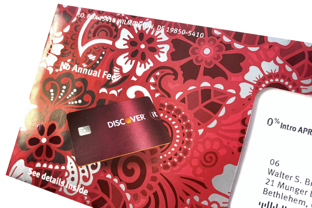
1. Stand Apart from the Crowd
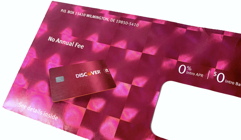
When utilizing an unusual substrate such as fresnel lens holographic paper, the best approach is often the easiest. Make the substrate the hero.
When utilizing an unusual substrate such as fresnel lens holographic paper, the best approach is often the easiest. Make the substrate the hero.
Discover Card printed a full bleed of red ink on top of the holography, but except for the actual card image, without any hits of opaque white underneath, so the full effect of the refracted light from the fresnel lens shines through. Its bright colors and unusual special effects make this piece stand miles apart from similar direct mail envelopes.
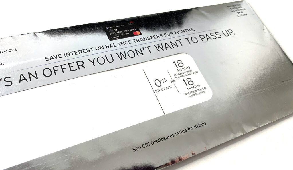
2. Make Customers Feel Like a Million Bucks
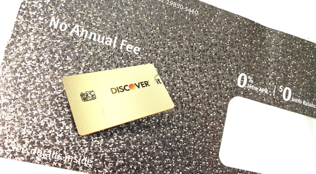
As symbols of prosperity, luxury, and success for centuries, metallics may be the most effective of all the colors. Metallic silver and gold embellishments on a direct mail envelope imply that the information contained within is prize-worthy, or may even make the recipient rich beyond their wildest imaginings.
3. Match the Design to your Audience
Geometric designs are trending with Zoomers (Generation Z). So it’s no surprise that college students, the demographic for this campaign, would find this cyan-to-magenta blend on geometric holographic paper intriguing.
No doubt this envelope got noticed—and opened—by a far greater percentage of college-age recipients than if it had been sent in a plain, white one.
4. Impress Your Audience with Artistry
This crimson floral illustration is beautifully enhanced by hits of a high-gloss spot UV that contrast against unprinted areas. These unprinted areas reveal the silver metallic paper underneath. In this instance, the special effects complement the floral illustration, transforming this commercial design into a work of art.
5. Mimic what Works
In the world of design, nothing is ever truly new. So when you stumble across a successful marketing technique, many companies will incorporate it into their own design strategies.
With a nod to Discover Card’s holographic direct mail campaigns, Citi Bank recently started printing their envelopes on holographic paper as well. This suggests that the designers at Discover hit upon such a goldmine of an idea when they started using holography on their envelopes that Citi Card decided to try it out on their customers as well.
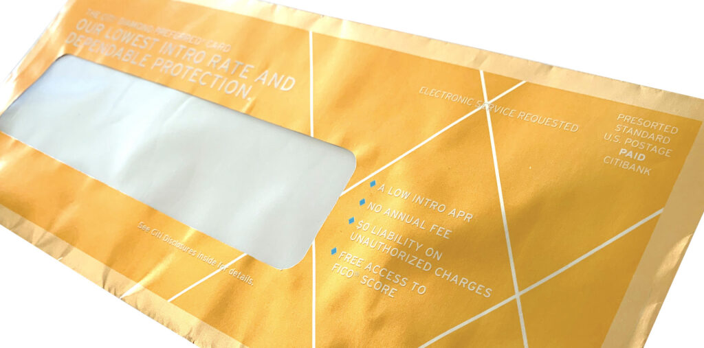
6. Embrace Design and Color Trends
According to Pantone and other color influencers, the signature color of 2021 is gold. Sometimes the best results will be achieved when you embrace the trends, as Citi Card did with their golden direct mail envelope.
Reminiscent of the golden ticket that Charlie found in a bar of Willy Wonka’s chocolate (and about the same size, too), this envelope design evokes feelings of winning, success, and celebration that will no doubt encourage recipients to take a peek inside.
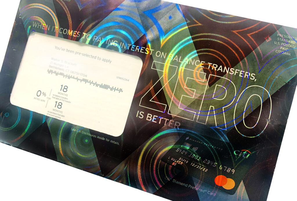
7. Go Big or Go Home
Sometimes bigger (or crazier) IS actually better. In this example, Citi Card pulled out all the stops when they utilized a bold, in-your-face holographic circular pattern in their latest direct mail envelope. Not only that, but the envelope is oversized, so it cannot help but scream “read me”!
Although the semi-opaque ink coverage “tames the beast”, so to speak, there’s no denying that in the right light, the bold holographic pattern will stop recipients in their tracks. The circular pattern also subtly supports the zero fee offer.
In 1984, National Geographic made news when it became the first national magazine to feature holography on its cover (a label of an eagle). The following year, they applied a holographic label of a skull to a printed cover. Then in 1988, they published the first-ever ink-free, entirely holographic cover.
The 1988 National Geographic cover was the first entirely ink-free magazine cover design.
Each of these issues have since gone on to become collector’s items. But holography, which was once desirable for its cutting-edge appeal has, in the following decades, lost its glamour. Consumers have become used to seeing the tiny holographic stickers on their credit cards and checks. And the public’s fondness for innovative technology has shifted to QR codes and augmented reality (AR).
Even so, holography remains a useful tool for package designers, helping to solve tricky design challenges as they arise.
Keep it Fresh
Growing up on TikTok, YouTube, and other bits of digital wizardry, Millennials and Gen Z’ers have a shorter attention span than their less tech-savvy forebearers. In fact, according to one report, Millennials have a 12-second attention span but Zoomers just 8. As such, marketers must now identify new ways to attract their attention while being innovative, relevant, and fun.
When Lit Co. challenged Jamison Perkins of Jamison’s Design to design the packaging for ceramic shot glasses for 20-somethings, he was up for the task.
To complement the glass’ pastel colors, he chose to laminate rainbow holographic paper to corrugate. The corrugate protected the breakable glass from damage during transit while the eye-catching holographic litho-lam appealed to younger buyers.
Designs for Upscale Elegance
Although younger audiences respond well to bright colors and bold patterns, holography can also be the ideal surface for luxury brand packaging.
In 2016-18, social norms and fashions shifted to a more casual, athletic vibe. As such, Victoria’s Secret, which had remained steadfast in its branding since the 1990s, began losing market share. In an effort to stay relevant, VS shifted their strategy from the glitz, glitter, and glamour they had previously embraced to a more elevated, upscale aesthetic.
Although holography is often considered to be most relevant to a younger demographic, when given the right design treatment, it can also be the ideal surface for luxury branding.
In the case of Dream Angel’s perfume packaging, the original carton design featured pastel clouds on holographic foil. Unfortunately, this no longer fit VS’ rebranding initiative. Moreover, the team needed to reflect the refractive fragrance bottle and the “rainbow glow” scent in the packaging.
The solution? Packaging team Design Director Stephen Moss made the actual rainbow holographic board the hero of the redesigned fragrance box.
This was a wise choice. The pop of color appealed to younger generations while mature consumers appreciated its more formal composition and understated elegance.
Reflect the Product Within
Sometimes the best designs are developed when designers seek to mirror the actual product. In such cases, holography may be the perfect solution.
Don Romine of Impress Communications found this to be the case when Jeffree Star Cosmetics asked him to collaborate on a design for their Liquid Frost Highlighter.
Romine wanted to represent the highlighters’ oil-on-water appearance on the actual packaging. After much experimentation, he achieved the effect by printing the carton onto holographic board that featured aswirl pattern. Since the pattern is random, each carton became a unique, one-of-a-kind statement piece, the perfect reflection of the product within.
Revitalize Tired Packaging
Since holographic effects are unlimited, the technique can also revitalize a tired packaging design. Holography also adds dimensionality to cartons that are restricted to a certain size, such as with DVD case jackets or game boxes.
Tasked by a film studio to design a DVD case that stood out from the hundreds of others with the same dimensions, Debbie Bishop of DB Design went out on a limb. She decided to overprint holographic board with designs that allowed the holographic pattern to show through. The holography enhanced the DVD’s shelf presence AND ultimately transformed the DVD into a collector’s item!
Today, holography is no longer just used to make a statement about cutting-edge technology; rather, it can solve tricky design challenges, elevate a brand, reach younger audiences, and even to gain an advantage over their competitors.
With Mainline Holographics‘ new white holographic technique—and recyclable holographic board on the horizon—the art of holography has become an indispensable tool for designers the world over.